


Let’s take a look at two pages to see why shadowing is so important.
Here is a layout where there is no shadowing:

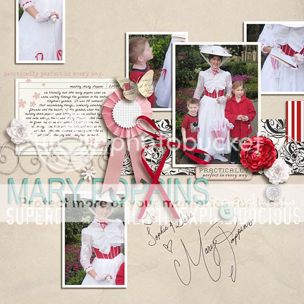
Now, check out this layout in comparison.

Do you see the difference? The first layout obviously has no shadows, no depth and no realism. The second layout, however, pops off the page. The elements look as if you could reach out and touch them! This is why shadowing is so important and also so fun. It is amazing to see your scrapbook pages come to life with just the click of a button!

Basic Shadowing
Let’s start with the very basics for those that are new to digital scrapbooking.
In order to shadow an element, you will first need to select the piece that you want to shadow. You will then want to click the little “fx” icon at the bottom of your layers palette.

This will bring up a fly out box with several different layers styles. You will want to select or click on “Drop Shadow.” When you do that, the drop shadow box will open. I always keep the preview box (circled) checked so I can see what my shadow looks like. All the different sliders and numbers can be so confusing, so let me point out the main things that I adjust depending on the element.

Let’s start from the top arrow and work our way down.
The Blend Mode:
The default blend mode for photoshop programs is multiply. However, when it comes to shadows, most digital scrappers choose one of two blend modes: multiply or linear burn. Peppermint Granberg of One Little Bird Designs gives a great description of the differences between the two modes.
“Multiply “multiplies” the average color intensity of the top layer with the average intensity of the bottom layer. This produces darker colors within the composite image and creates contrast. Linear Burn also produces darker colors within the composite image, however the main difference is that Linear Burn breaks the bottom layer down into its individual color channels (for scrapbooking those are your R(ed), G(reen), and B(lue) channels) to determine the degree of darkness for each pixel in the top layer. Channel information for each color is used and the darkest color’s intensity is increased by a certain degree. So your shadows have more variation throughout, depending on all the colors beneath them”
There is a debate as to which is better, but I say use them both! Sometimes Linear burn is too dark, and multiply gives a better look to the shadow. Depending on the paper color, linear burn can also look a little bronze. But don’t dismiss that blend mode, because quite often linear burn gives you an amazing realistic shadow. The key is to play around with the mode until you get the look you want.
Opacity: This determines how dark or light you want your shadow to be. If I use multiply as my blend mode, my opacity is around 68-74. With linear burn my average opacity is around 54. Again the key is to play around with that slider. So many things will affect your opacity level from the blend mode, to the color of your paper and so on.
Angle: The angle is the setting that determines what direction your light source is coming from. Photoshop has a default angle of 120. Many people use that angle and it looks fine, however I prefer an angle of 45, as it has a more realistic look to me.
Distance: The distance will determine how far off the paper your element will appear to be. If you are layering several bulky elements underneath a photo, realistically that photo would be quite a distance from the background. So your distance would be greater. Alternately, if a flat element is sitting on top of the paper, it would have a very small distance. You want to try and picture how it would look in real life.
Size: This determines the blur of your shadow. You can play around with this to see how it affects the look of your shadow.
You might be thinking…how in the world do I know how to adjust those settings? Here is a list of how I generally shadow these elements:
Flat Paper/photos: distance 14/size 20
Stacked Paper/photos: distance 20/size 21
Flat Ribbons/strings: distance 33/ size 35
Ribbons/strings: distance 46/ size 49
Flowers: distance 46/ size 49
Stitches/staples: distance 7/ size 12
Again, these are just average settings. If I’m stacking elements, I would have to increase the distance and size on those elements that are stacked on top. The key is to imagine how it would look in real life.
This is a great starting point, and you can achieve great looking pages!!
If you are interested in shadowing and realism... let's take it one step further.
Here are some techniques to give you a more realistic shadows!
Advanced Shadowing
Now, in reality we know that nothing lies perfectly flat on paper and our shadows won’t always be perfectly uniform, especially with elements like strings and ribbons. Here are some screen shots with an explanation of how you can adjust your shadows to make them look even more realistic.
I will demonstrate with a string. Here I have a simple string on a background paper.

As you can see, I have added my basic string shadow to the element, but in real life shadows sometimes run deeper in some areas and thinner in others. So lets give it some more life. To do this, the first thing you will need to do is to put your string’s shadow on its own layer. With the string highlighted in the layers palette, you will right click the little fx symbol that is on that layer.

When you do that, a fly out box will appear and you will want to select “Create layer.”

After doing this step, your string will be on its own separate layer. So you should have two layers, one is the actual element, the other its shadow.
Now we can manipulate the shadow without affecting the actual element.

There are a couple different ways to play with the shadow. I’ll show you both, and you can decide which works best for you.
You will want to select the shadow layer in your layers palette.
The first way to alter your shadow is by using the warp tool. You can go to Edit/transform/warp to bring up the warp box around your element. Or you can hit ctrl/T and then select the warp icon as shown here:

The way this works is that the shadow can be altered by left clicking any of those points on the warp box and pulling a point to stretch the shadow. I quickly warped this shadow to give you an idea of how it can change the look. (see below)

Another way to warp your shadow is by using the smudge tool. (I like to use this most with shadowing my flowers.)

When you select the smudge tool, you will want to select a soft round brush. The size will depend on the area of the element you are adjusting. To adjust this string, my brush size varied from 400 to 650 depending on the area I was trying to smudge. I always keep my strength set to 50.
To alter the shadow, you will left click the area you want to smudge and pull on the shadow slightly.

Personally I feel that the smudge tool gives you much more control when altering your shadow, so I prefer it over the warp tool. After I’ve adjusted the shadow to my liking, I also link the two layers to keep them together. It makes it easier when you are creating your page and moving your elements around.
I also know that some of you are photoshop elements users. I have never worked with elements, but there are tutorials out there that can help explain shadowing for your specific program. You can check out one such tutorial here, and if you do a google search you can explore others as well.
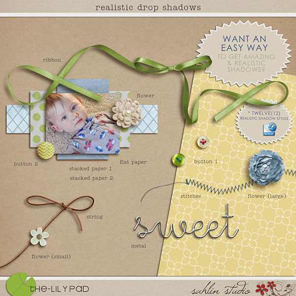
I hope this gives you more insight on "how-to" work with your digital shadows. If you'd like to have shadows at one "click of a button", feel free to check out "Realistic Drop Shadow Styles" in my shop. It will make shadowing a breeze!

Check out these layouts that inspired the shadow style!


9 comments:
What a great tutorial! Love it, thanks!
What a great TUT. I use elements at home but CS5 at school. Thanks!
Love this tutorial! Thanks so much for taking the time to explain it!
Great tut! Will this work on PSE?
I have never worked with elements, but there are tutorials out there that can help explain shadowing for your specific program. You can check out a link to a PSE tutorial that I listed at the bottom of the post.
Thanks for this great tutorial! I've always wished I could create a shadow in it's own layer without having to make it from scratch. Who knew it was so easy!
I never thought to use the smudge tool either. Brilliant!
thanks for this GREAT tutorial, Krista, I'm always trying to improve the shadows and your post is very helpful! I'm off to check out the links you suggested :) :)
xo
Excellent and always much appreciated tutorial, and how generous of you to share your personal style and secret settings, to make our layouts as pretty as they can be. Wonderful stuff, I am always a fan, but this post just made me love you that little bit more! Thank you.
Miss Renee
x
I am wondering how you shadow glitter?
Post a Comment